Client:

Pilon

Design.

Strategy.

Pilon Pte Ltd is a Singapore-based fintech company transforming supply chain financing through innovative digital solutions. Connecting banks, enterprises and suppliers, Pilon helps businesses unlock working capital, improve cash flow and build stronger financial ecosystems across Southeast Asia.

Design

Brand Identity

Website Design

graphic Design

Strategy

Brand Strategy

Brand Positioning

Strategy & Design

Bringing clarity to financial innovation.

Financial technology can be complex, but communicating its value shouldn’t be.

We worked with Pilon to create a cohesive brand and digital experience that balances innovation with credibility. Through thoughtful design and clear communication, we helped translate sophisticated financial solutions into a professional, accessible brand presence.

The result is a visual direction that reflects Pilon’s forward-thinking approach while building confidence among businesses and financial institutions.


Branding

A confident identity for a changing financial landscape.

We developed a contemporary brand identity that reflects Pilon’s position at the intersection of finance and technology.


From logo applications and typography to colour and visual language, the identity was designed to communicate professionalism, reliability and innovation.

The consistent visual system gives Pilon a recognisable presence across corporate communications, digital platforms and marketing materials.

Pilon Logo Concept

Inspired by Orion’s Belt, one of the most recognisable celestial formations, Pilon’s visual identity draws upon the symbolism of guidance, precision, and connectivity.

The constellation-inspired emblem reflects Pilon’s commitment to navigating the complexities of financial technology with clarity and confidence. 

Its interconnected points represent the seamless relationships between financial institutions, businesses, and technology, while the circular form conveys continuity, unity, and forward momentum.

Paired with a refined blue palette and contemporary typography, the identity communicates innovation, reliability, and trust, positioning Pilon as a forward-thinking fintech solutions provider.

Pilon_namecard

Colors

Primary
#092248
Accent
#2c3b7b
#4dcde1
#C7D3FF
#000000

Primary Font

Lato

abcdefghijklmnopqrstuvwxyz
1234567890

Website

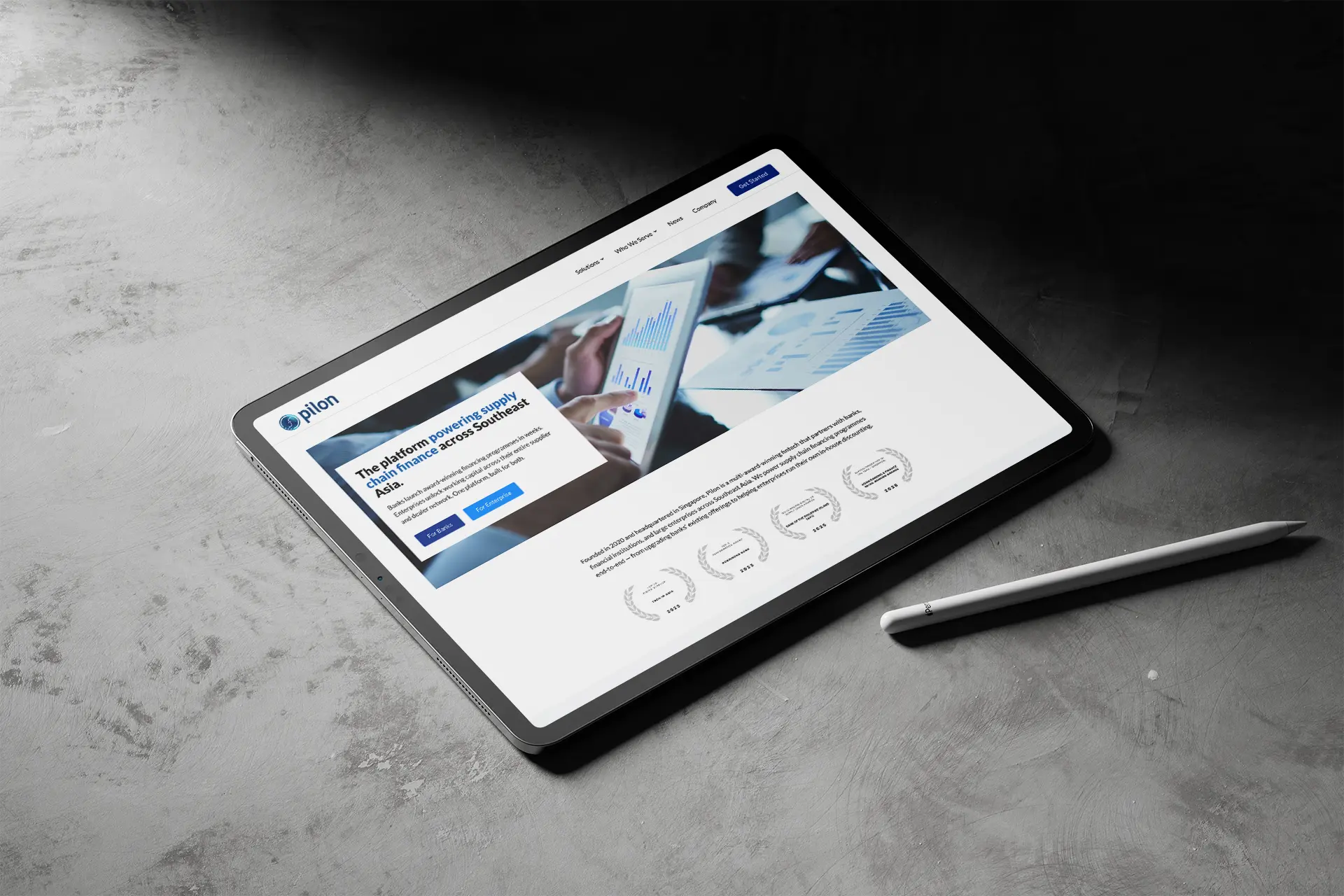
Simplifying complexity through digital experience.

We translated Pilon’s brand into a digital experience that makes its financial solutions easier to explore and understand.


Through considered UI/UX design, clear information hierarchy and engaging visual elements, the website communicates Pilon’s capabilities while guiding visitors through its services.

The result is a professional, intuitive online presence that balances technical information with accessibility and usability.

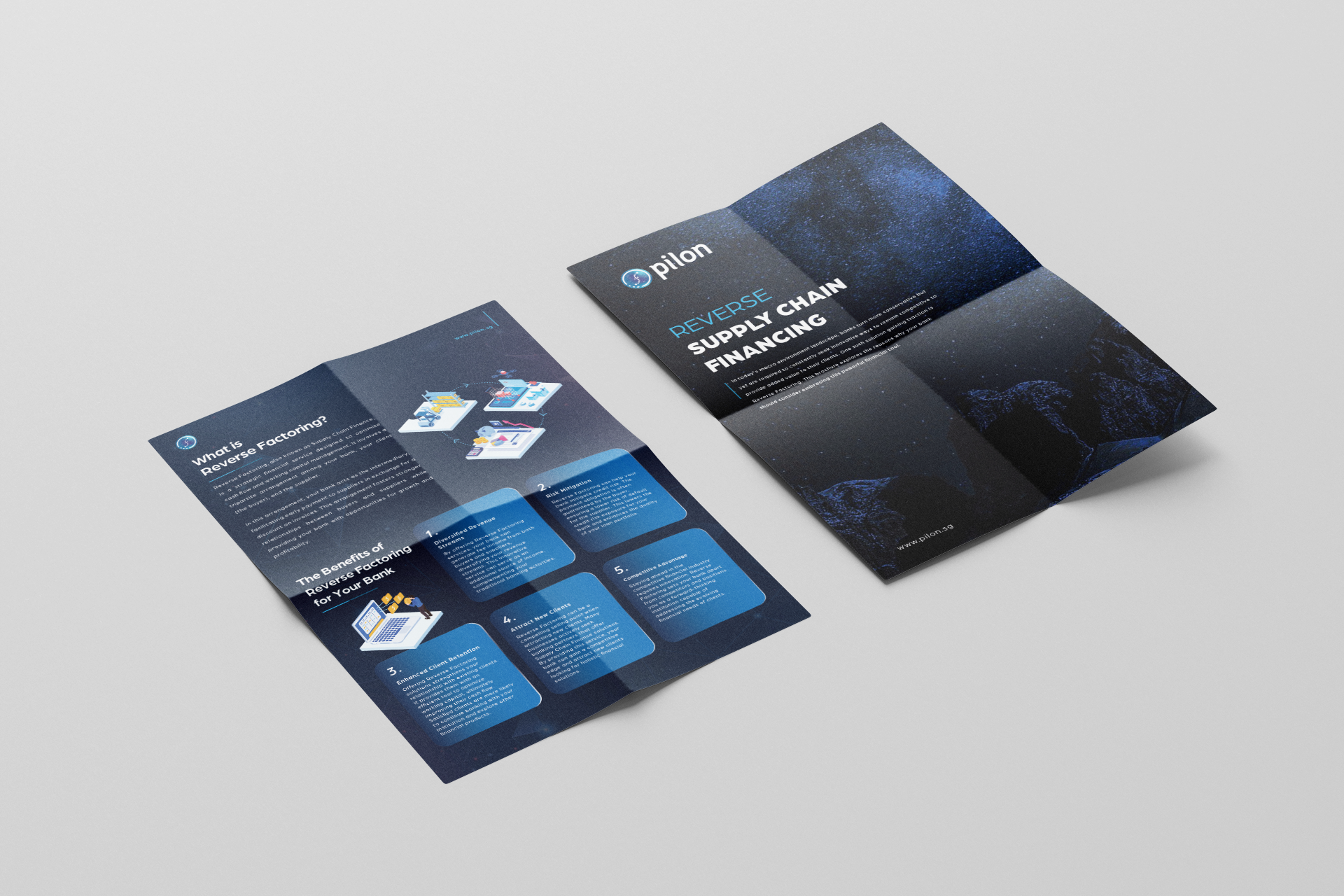
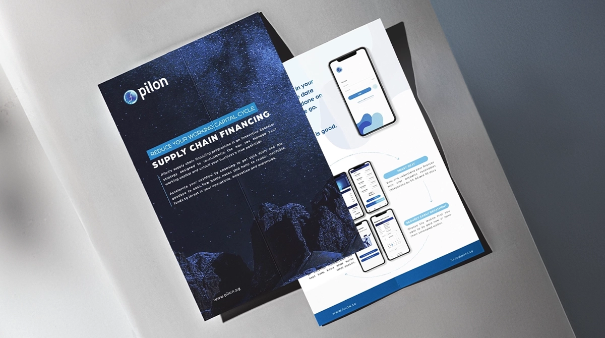
Brand Applications

Creating consistency across every touchpoint.

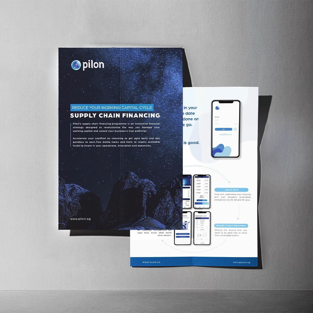
We extended Pilon’s identity across corporate and marketing materials, including business stationery, brochures and digital communications.


Each application was designed to maintain a consistent visual language while presenting complex financial concepts in a clear and engaging way.

Together, these touchpoints strengthen Pilon’s brand recognition and create a cohesive experience across physical and digital channels.
Pilon Brochure