Client:

Centurion Law LLC

Design.

Strategy.

Centurion Law LLC is a Singapore law firm with practices spanning criminal defence, corporate and shareholder disputes, private wealth, insolvency and restructuring, and other complex legal matters.

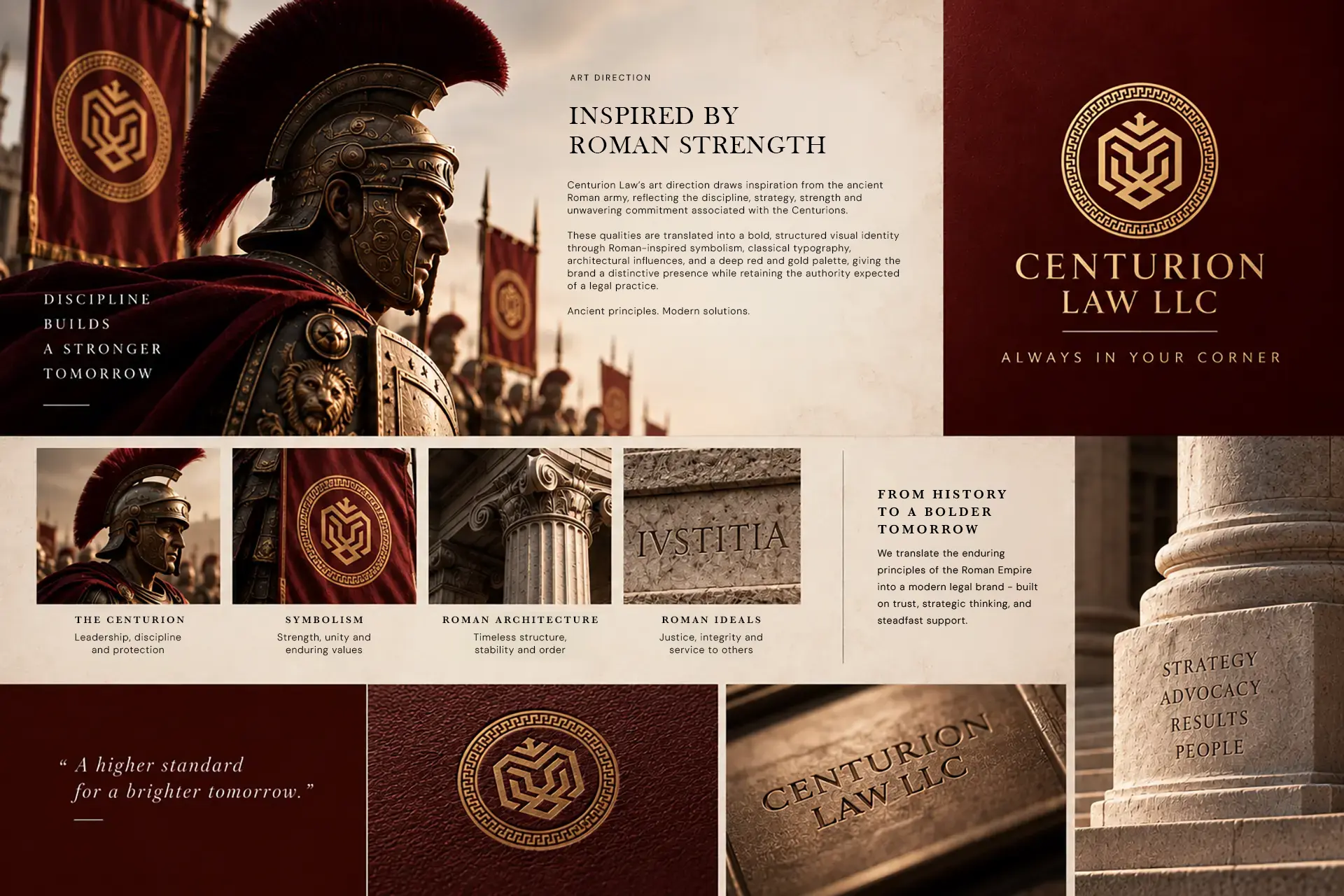
Inspired by the Roman Centurions and the values of leadership, courage, strength and loyalty, Centurion needed a brand that could express strength and confidence while remaining professional, credible and human.

BWS Agency developed the brand across strategy, identity, website and brand applications, creating a cohesive presence built around one clear idea: always being in the client’s corner.

Design

Brand Identity

Website Design

graphic Design

Strategy

Brand Strategy

Brand Positioning

Strategy & Design

Strength with purpose.

For a law firm, strength alone isn’t enough. The brand also needs to communicate trust, clarity and the confidence that someone is standing beside you when it matters.

We built Centurion’s brand around that balance. Drawing from the symbolism of the Roman Centurion, we developed a visual and digital identity that feels strong and assured without becoming overly traditional or corporate.

The result is a brand designed to reflect Centurion’s approach to its clients: strategic, committed and always in their corner.

Branding

A symbol of strength.

At the centre of the identity is the tiger, a symbol of courage, leadership and unwavering resolve.

Paired with a deep red and gold colour palette, the identity gives Centurion a distinctive presence while retaining the authority expected of a legal practice.

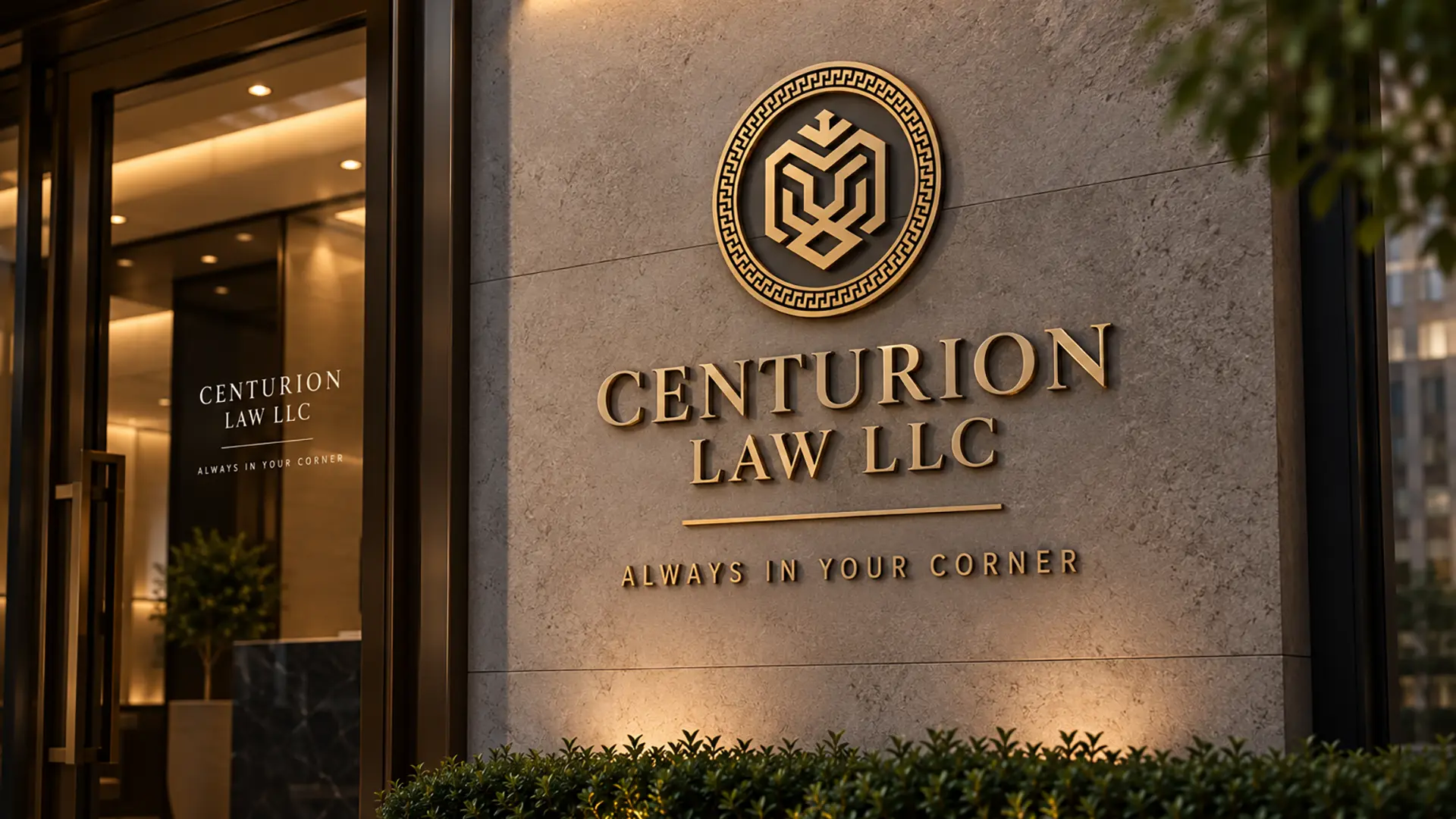
From the logo and typography to colour, imagery and visual language, we created a consistent brand system that could move confidently across digital and physical touchpoints.

The Centurion Emblem

Inspired by the strength and discipline of the ancient Roman Centurion, the geometric face forms a bold symbol of courage, leadership and unwavering resolve. Its structured lines reflect Centurion Law LLC’s confident and steadfast approach to standing beside its clients.

Encircling the emblem is the Greek meander, an ancient motif symbolising eternity, unity and continuity. It represents the firm’s enduring commitment to its clients and the pursuit of justice.

Together, the elements create a mark that feels strong, timeless and resolute, reflecting the promise behind the brand: Always in Your Corner.

Colors

Primary
#4f000
Accent
#FFD167
#D29238
#AE4725
#7E2117

Primary Font [Serif]

Quattrocento

abcdefghijklmnopqrstuvwxyz
1234567890

Secondary Font [San Serif]

DM Sans

abcdefghijklmnopqrstuvwxyz
1234567890
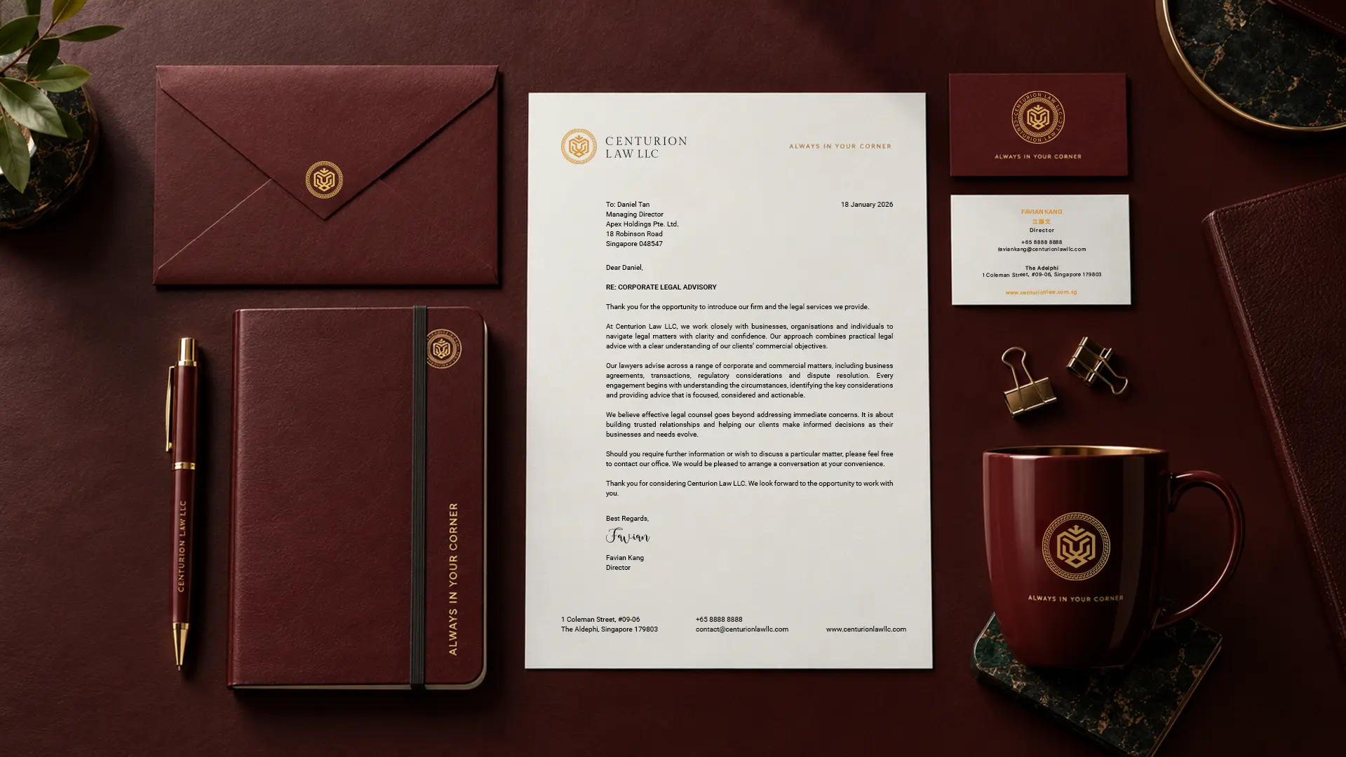
Centurion-stationery-set

Website

Bringing confidence into the digital experience.

We translated Centurion’s identity into a website that puts its people, expertise and track record at the forefront.


The digital experience balances strong visual expression with clear information architecture, helping visitors understand the firm’s areas of practice, lawyers and notable cases without making the experience feel overly complex.

The result is a professional yet approachable digital presence that carries the Centurion brand consistently from first impression to enquiry.

Brand Applications

Building consistency beyond the website.

The Centurion identity extends beyond its logo and website into the everyday moments where people experience the brand.


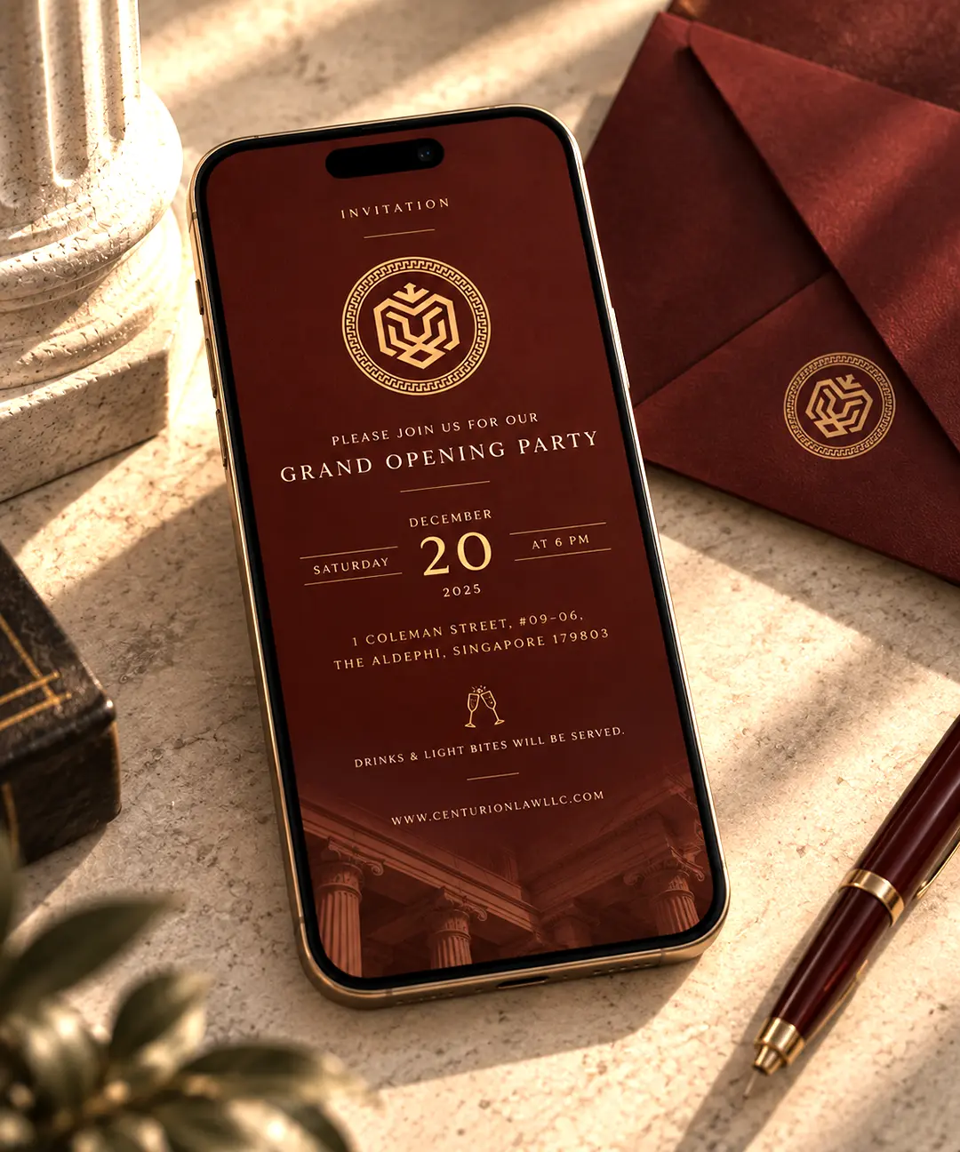
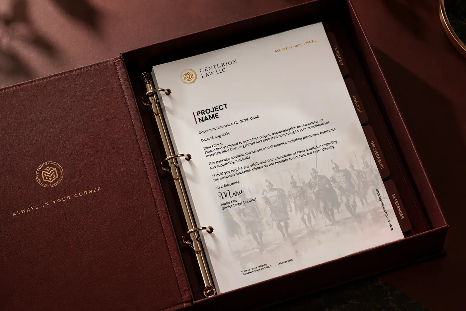
BWS Agency developed a range of brand applications, including event invitations, corporate communications and art direction for photography.

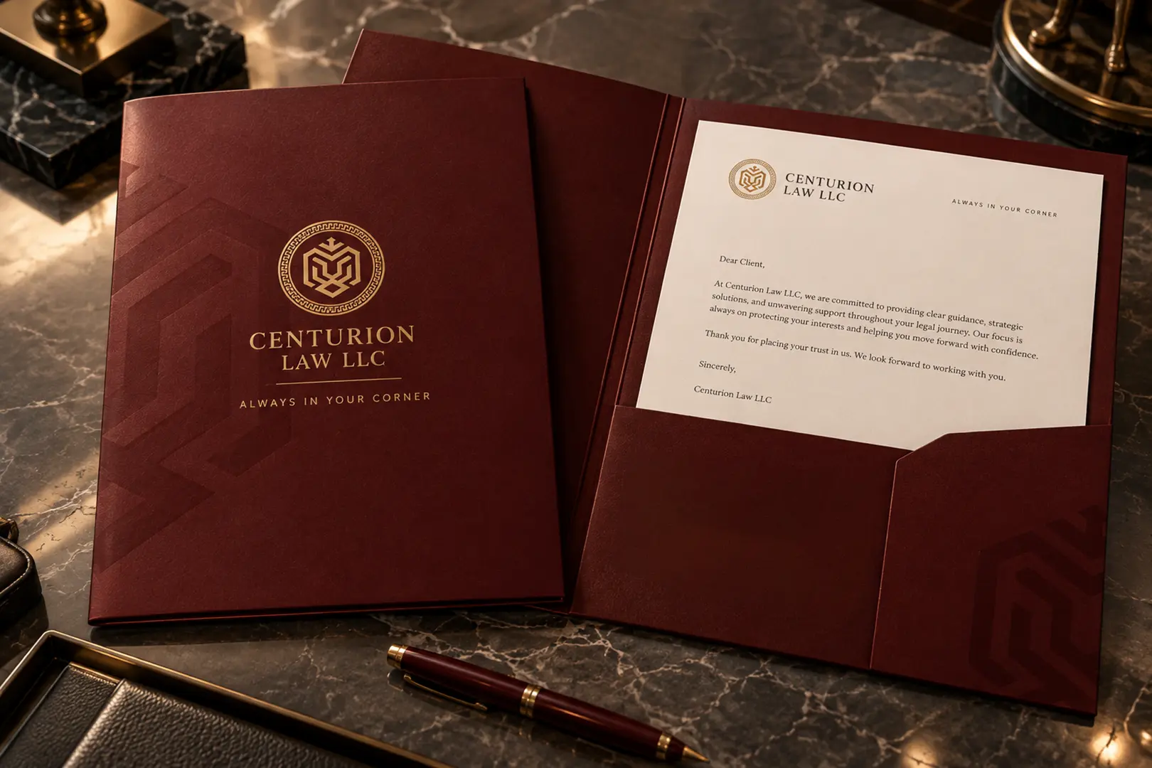
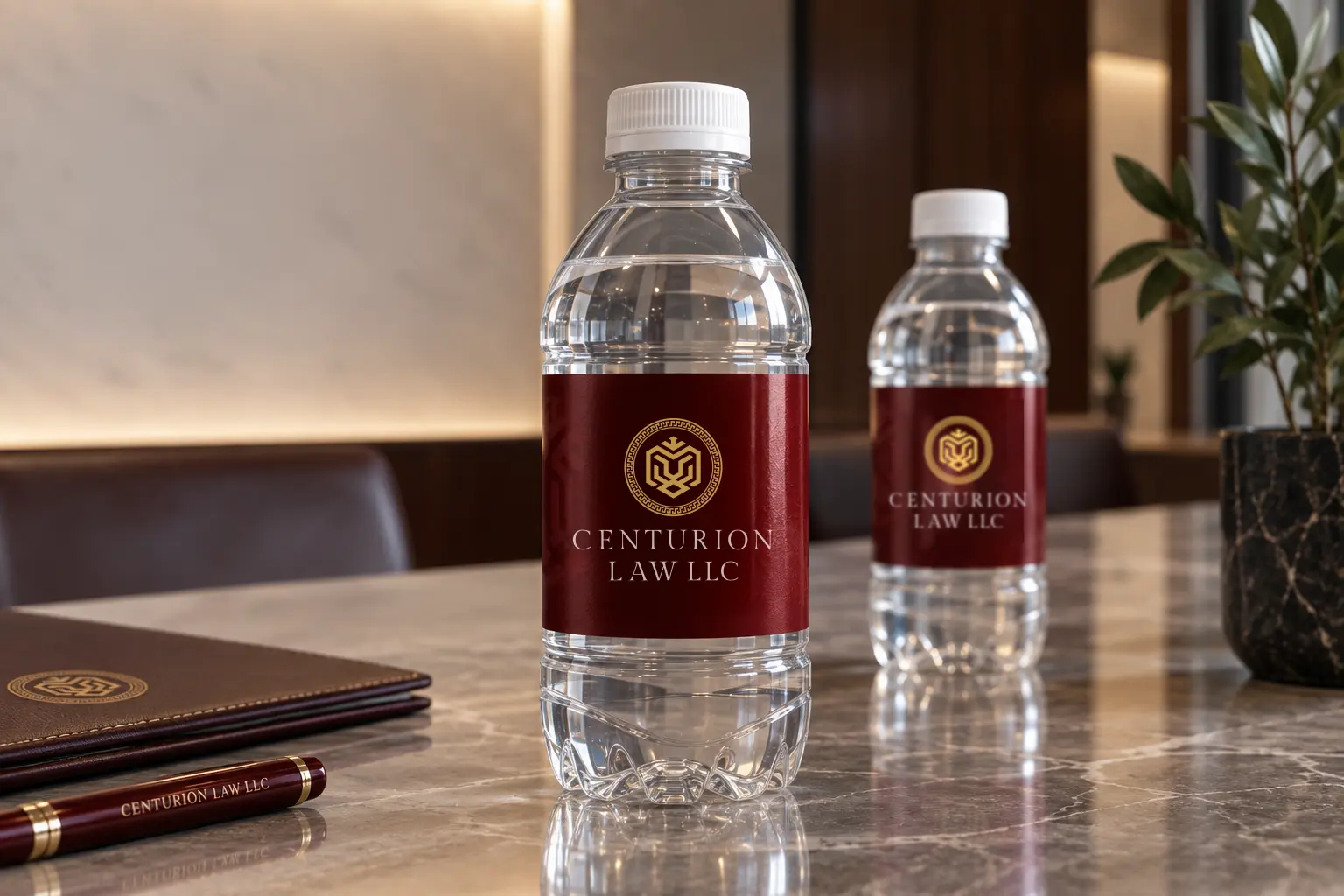
Each touchpoint was designed as part of the same visual system, helping Centurion maintain a recognisable and consistent presence whether online, in print or in person.

Centurion-law-binder
Centurion-Law_water bottle design